Workbook Statistical process control
control limits do not come from your tolerance
This is the most common mistake in statistical process control, and it hides problems rather than finding them. Control limits describe what your process is doing. Specification limits describe what you want it to do. Draw the first from the second and the chart can never tell you anything you did not already assume.
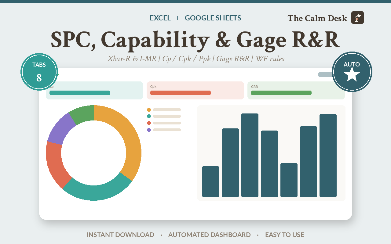
A control chart plots your measurements over time with limits at plus and minus three standard deviations of the process itself. Points outside those limits, or patterns inside them, mean something has changed.
Those limits must be calculated from your data, never from your tolerance. And before you trust any of it, you have to know your measurement system is not the thing producing the variation — which is what a Gage R&R study is for, and why it comes first.
Two limits that sound the same and are not
Imagine you are cutting parts that need to be 10mm, and the customer will accept anything between 9.5mm and 10.5mm. Those two numbers are your specification limits. They are a requirement.
Now measure what your machine actually produces. Perhaps it runs at 10.02mm with a spread of about 0.02mm either side. That spread is your control limits. They are an observation.
Here is why confusing them is dangerous. Your tolerance is wide — a full millimetre. Your process is tight. If you draw the chart lines at 9.5 and 10.5, the machine could drift from 10.02 to 10.3, which is a completely different machine behaving in a completely different way, and your chart would show nothing at all, because 10.3 is still inside the tolerance.
You would find out when the drift finally crossed the spec line — by which point you have been making parts that are getting worse for weeks, and you have no idea when it started.
The whole value of a control chart is that it catches change before it becomes a defect. Drawing the limits from the tolerance throws that away and leaves you with a very expensive go/no-go gauge.
The other separation people collapse
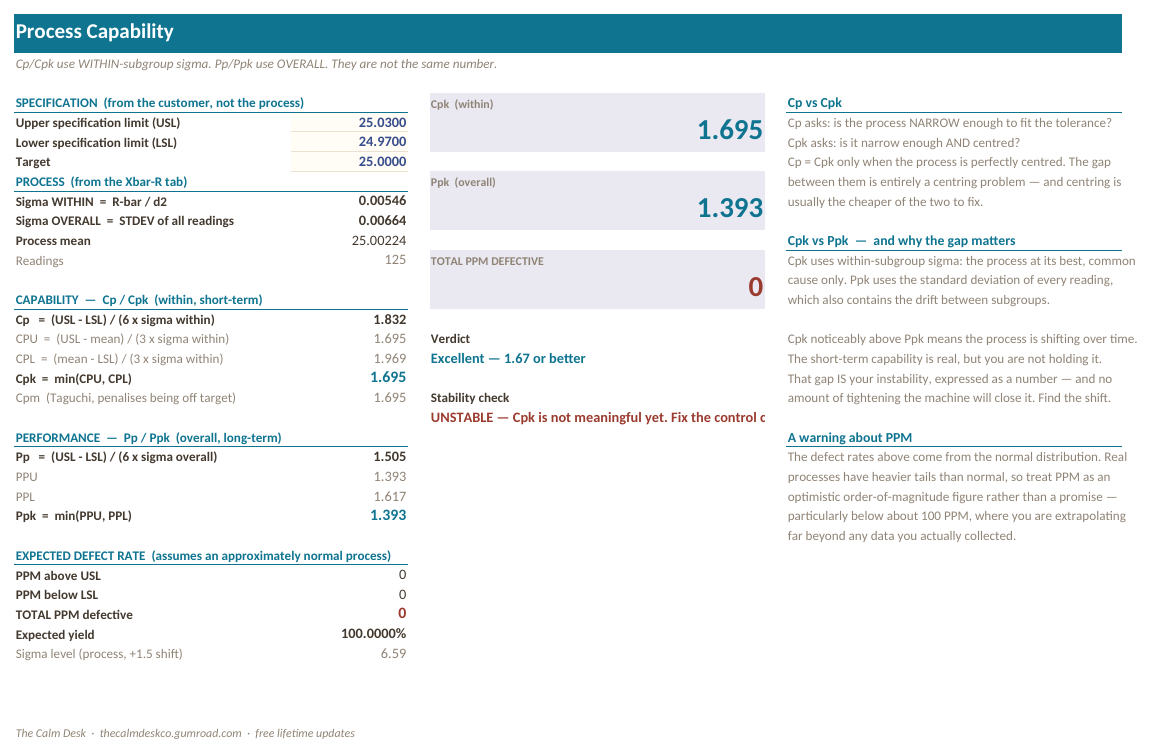
There are two standard deviations in capability analysis, they are different numbers, and the gap between them is information rather than noise. Cp and Cpk use within-subgroup sigma; Pp and Ppk use overall sigma.
| Statistic | Value | Which sigma | What it tells you |
|---|---|---|---|
| Sigma within (R̄/d₂) | 0.005458 | Within subgroups | How tightly the machine holds over a short run. |
| Sigma overall | 0.006644 | All the data | How tightly it holds across the whole period, drift included. |
| Cp / Cpk | 1.832 / 1.695 | Within | Capability — what the process could do if it stayed put. |
| Pp / Ppk | 1.505 / 1.393 | Overall | Performance — what it actually did. |
| Cpk − Ppk gap | 0.303 | The drift, expressed as a number |
That 0.303 gap is the instability. A workbook that computes one sigma and uses it for all four statistics makes Cp equal Pp and the gap disappear — which does not mean the process is stable, only that you can no longer see that it is not.
Why Gage R&R has to come first
Before any of this means anything, you need to know that the variation you are charting is coming from the process and not from the measuring.
If two operators measure the same part and get different answers, or the same operator gets a different answer twice, then some of the spread on your chart is your gauge, not your machine. A Gage R&R study separates the two.
This workbook uses the AIAG average-and-range method with the published K1, K2 and K3 constants — which is why it is fixed at 10 parts, 3 operators and 3 trials. On the shipped data %GRR comes out at 12.32% with 11 distinct categories, which is an acceptable measurement system. The study is deliberately seeded with real operator bias so you can see the method detect something.
How to run an SPC study that means something
Prove the gauge before you trust the data
Ten parts, three operators, three trials each. Look at %GRR and the number of distinct categories. If the gauge is a large share of your variation, everything downstream is measuring your measuring.
Pick the right chart for your data
Subgroups of parts measured together: Xbar-R. One measurement at a time: I-MR. Counting defectives out of a batch: p-chart. All three are in the workbook and all three carry their own rules.
Calculate the limits from your data, never your tolerance
Nothing in this workbook can compute a control limit from a spec limit — there is no path from one to the other, on purpose.
The constants are a visible lookup table rather than magic numbers. d₂ is the expected range of n standard normal deviates; A₂ = 3/(d₂√n); D₃ = 0 below n=7, which is why small-subgroup R charts have no lower limit.
Apply the rules, each in its own column
Five rules, five columns. Which rule fired tells you what kind of cause to go looking for — a single point beyond three sigma is a different investigation from nine points on one side of the centre line. A combined flag throws that away.
Only then calculate capability
Capability on an out-of-control process is a meaningless number, because there is no single process to be capable. The Capability tab checks stability first and says so.
Keep the two sigmas separate. The gap between the pairs is the drift, and it is the most useful thing on the tab.
What is inside the file
Eight tabs. The sample data is deliberately imperfect: the Xbar-R run shifts over its last eight subgroups, the I-MR series has a special-cause spike, one p-chart lot is out of control, and the Gage R&R has genuine operator bias. A clean demo would teach you nothing about whether the rules work.
| Tab | What it does |
|---|---|
| Start Here | What to fill in, in what order, and how to import the file into Google Sheets. |
| Constants | d2, A2, D3, D4 and the Gage R&R K factors, as a visible table rather than magic numbers. |
| Xbar-R | Subgroup averages and ranges, with control limits and five Western Electric rules, each in its own column. |
| I-MR | Individuals and moving range, for when you measure one at a time. |
| p-Chart | Proportion defective, with limits that change as lot size changes. |
| Capability | Cp, Cpk, Pp, Ppk and PPM — with a stability check first, because capability on an unstable process is meaningless. |
| Gage R&R | The full AIAG average-and-range study: 10 parts, 3 operators, 3 trials, %GRR and distinct categories. |
| How It Works | Every statistic, defined and derived. |
Opening it in Excel, Google Sheets or Numbers
It is one .xlsx file. There are no macros, no add-ins and nothing to install, which is what makes it portable — a macro-driven template would be Excel-only.
| App | How to open it |
|---|---|
| Microsoft Excel | Double-click the file. Excel 2016 and later, and Microsoft 365, on Windows or Mac. Nothing to enable and nothing to install. |
| Google Sheets | Go to Google Drive, click New → File upload and pick the .xlsx. Then double-click it in Drive and choose Open with → Google Sheets. To keep a native copy, use File → Save as Google Sheets. Formatting and formulas both carry over. |
| Apple Numbers (Mac, iPad, iPhone) | Numbers opens .xlsx directly — double-click it, or in Numbers use File → Open and select the file. Numbers converts it on open and will list anything it changed. To send a copy back to someone on Excel, use File → Export To → Excel. |
| LibreOffice Calc | Free, and opens the file as-is on Windows, Mac and Linux. This is what I use to recalculate every workbook when I check the maths, so it is the app these files are tested hardest in. |
This one leans on NORMSDIST and STDEV — the functions people most often worry about losing in another app. All of them exist in Excel, Google Sheets, Apple Numbers and LibreOffice Calc, so the file works the same in all four.
Get the workbook
$79 one-off · no subscription
- One .xlsx file, eight tabs, works in Excel, Google Sheets, Numbers and LibreOffice
- Three chart types with five Western Electric rules, each rule in its own column
- Cp, Cpk, Pp and Ppk from properly separated sigmas, plus PPM
- A complete AIAG average-and-range Gage R&R study
- Deliberately imperfect sample data, so you can watch the rules fire
- Free lifetime updates
Instant download from Gumroad. No add-in and no macros — which is what makes it work in Google Sheets and Numbers too.
The arithmetic, written out
sigma within  = R-bar / d2                  # from subgroup ranges
sigma overall = STDEV(all measurements)

Cp  = (USL - LSL) / (6 x sigma within)
Cpk = MIN(USL - mean, mean - LSL) / (3 x sigma within)
Pp  = (USL - LSL) / (6 x sigma overall)
Ppk = MIN(USL - mean, mean - LSL) / (3 x sigma overall)

Xbar chart limits = X-double-bar +/- A2 x R-bar
R chart limits    = D3 x R-bar, D4 x R-bar
Cp and Pp measure spread against tolerance. Cpk and Ppk add centring — they use the nearer specification limit, so a process can have excellent Cp and poor Cpk simply by sitting off target.
And note what is not in these formulas: no specification limit appears anywhere in a control limit. USL and LSL only ever show up in capability.
How I know the numbers are right
Thirty numeric checks and seven property assertions. Every statistic is reimplemented in Python from its definition, the workbook is recalculated in LibreOffice, and the two are diffed to 1e-9. Last run: 0 mismatches, 0 property failures, 0 formula errors.
Value matching is not sufficient here, so it also asserts things that must be true of correct SPC:
- Sigma within must be less than sigma overall on drifting data, and the two must not be identical — which catches the conflation this page is about
- Cp > Pp and Cpk > Ppk must hold when the process drifts
- Every chart's rules must actually fire. A rule that never triggers is indistinguishable from a broken one
That last assertion earned its place. The Xbar-R status column is column T, but two KPI counters, the Capability tab's stability check and the verifier were all reading column S — which never contains a signal. The chart silently reported zero out-of-control points on data with twelve genuine violations, and the Capability tab would have declared an unstable process stable. The checker now asserts the signal count is greater than zero.
Compared with the alternatives
| Cost | Separate sigmas | Gage R&R | Rules itemised | |
|---|---|---|---|---|
| This workbook | $79 | Yes | Full AIAG study | Five columns |
| A free SPC template | $0 | Usually one sigma | No | One flag |
| Minitab | ~$2,000 / year | Yes | Yes | Yes |
| Your customer's supplied form | $0 | Varies | No | No |
Questions people ask before buying
Why can't control limits come from specification limits?
Because they answer different questions. Control limits describe what your process is doing; specification limits describe what you want. If your tolerance is wider than your process, limits drawn from the tolerance will not react to a real drift until it has already become a defect — which is exactly the warning a control chart exists to give.
What is the difference between Cpk and Ppk?
Cpk uses within-subgroup sigma and describes what the process could do if it held still. Ppk uses overall sigma and describes what it actually did. The gap between them is the drift. On the sample data that gap is 0.303.
What is Gage R&R?
A study that works out how much of the variation you are seeing comes from your measurement system rather than your process. Ten parts, three operators, three trials. If the gauge is a large share of the total, your control chart is partly charting your gauge.
Does it need an add-in?
No. Everything is native spreadsheet formulas, which is why it works identically in Excel, Google Sheets, Numbers and LibreOffice.
Why is Gage R&R fixed at 10 parts, 3 operators and 3 trials?
Because it uses the AIAG average-and-range method with the published K1, K2 and K3 constants, and those constants are defined for that study size.
Why are the Western Electric rules in separate columns?
Because which rule fired tells you what kind of cause to look for. A point beyond three sigma is a different investigation from nine points on one side of the centre line.
Is the sample data clean?
Deliberately not. The Xbar-R run shifts over its last eight subgroups, the I-MR series has a spike, one p-chart lot is out of control, and the Gage R&R has real operator bias. You need to see the rules fire to trust them.
Will it work in Google Sheets?
Yes. It uses STDEV and NORMSDIST, both of which Sheets and Numbers support.
Related spreadsheets
Ready to stop doing this by hand?
$79 one-off · no subscription
- One .xlsx file, eight tabs, works in Excel, Google Sheets, Numbers and LibreOffice
- Three chart types with five Western Electric rules, each rule in its own column
- Cp, Cpk, Pp and Ppk from properly separated sigmas, plus PPM
- A complete AIAG average-and-range Gage R&R study
- Deliberately imperfect sample data, so you can watch the rules fire
- Free lifetime updates
Instant download from Gumroad. No add-in and no macros — which is what makes it work in Google Sheets and Numbers too.